2020 Personal Project
Package Design, Typography, Logo Design, Video Design
Adobe Photoshop, Adobe Illustrator, Adobe Premiere Pro
Adobe Photoshop, Adobe Illustrator, Adobe Premiere Pro
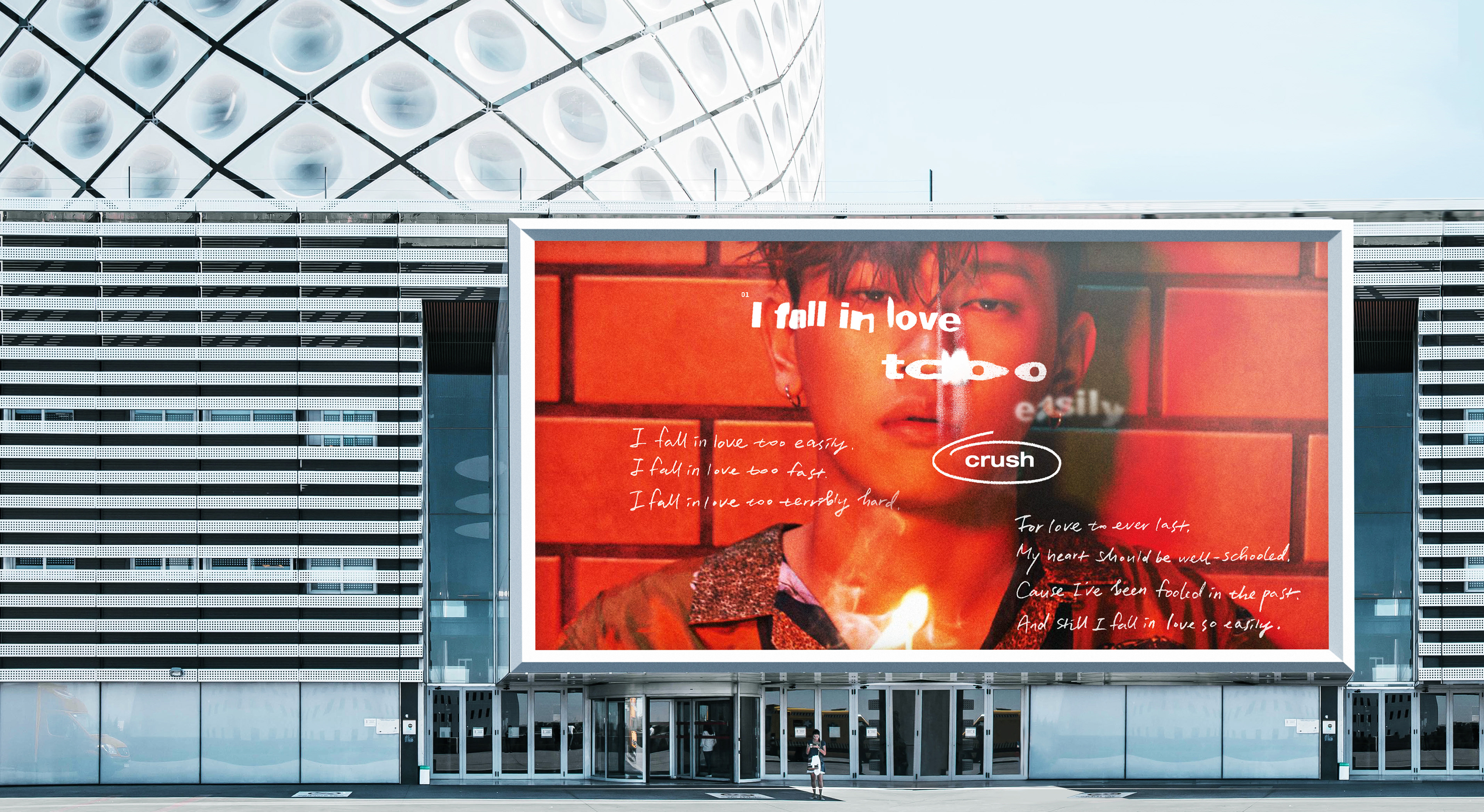
크러쉬 ‘I FALL IN LOVE TOO EASILY’의 앨범 디자인입니다.
This is the album design of Crush’s “I fall in love too easily.”


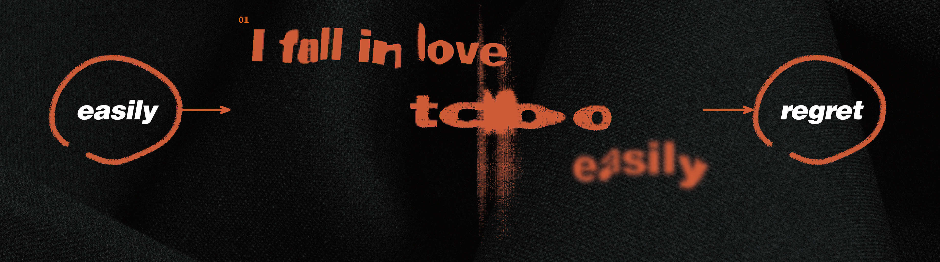
Title LOGO
사랑에 쉽게 빠지는 자신의 모습을 표현하는 가사, 그 속에 담겨있는 후회의 감정을 타이포그래피화 하였습니다. 꾸밈없는 산세리프체를 사용하여 일기를 쓰는 듯한 담담한 곡의 분위기를 담고자 하였습니다.
The lyrics expressing someone easily falling in love, and the feelings of regret contained in them were depicted. I wanted to capture the calm atmosphere of the song as if I were writing a diary using an undecorated San Serif style.
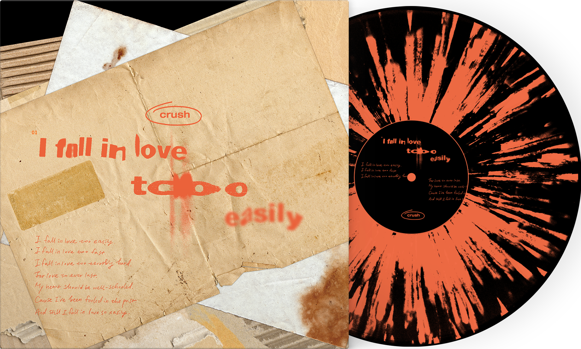
color system
사랑에 빠졌을 때를 ‘타는 불’에 비유하여, 그곳에서 튀는 불티에서 추출한 것으로 그을린 듯한 오렌지 색상은 ‘너무 쉽게 빠지는 사랑’의 이미지를 전달합니다.
When you fall in love, you compare it to a “burning fire,” and the burnt orange color, which is extracted from the spark that bounces there, conveys the image of “love that falls too easily.”


사랑이 지나간 후 남은 감정들과 상처들을 오염된 종이로 표현하였습니다. 지나간 사랑들은 경험이 되었고 다짐이 되었지만, 여전히 같은 모습을 반복하고 있는 상황을 겹겹이 쌓인 종이로 나타내었습니다.
The feelings and wounds left after love passed were expressed in contaminated paper. The past love has become an experience and a pledge, but the same thing is still repeated in layers of paper.
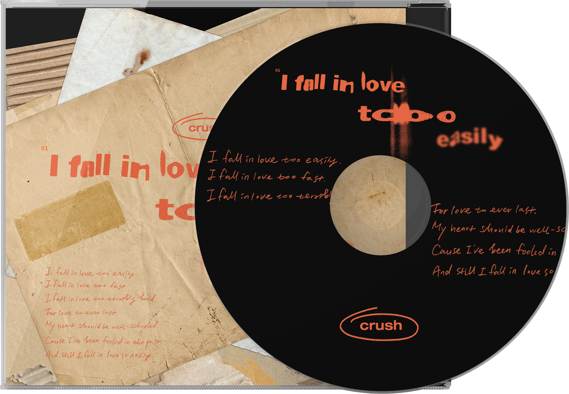
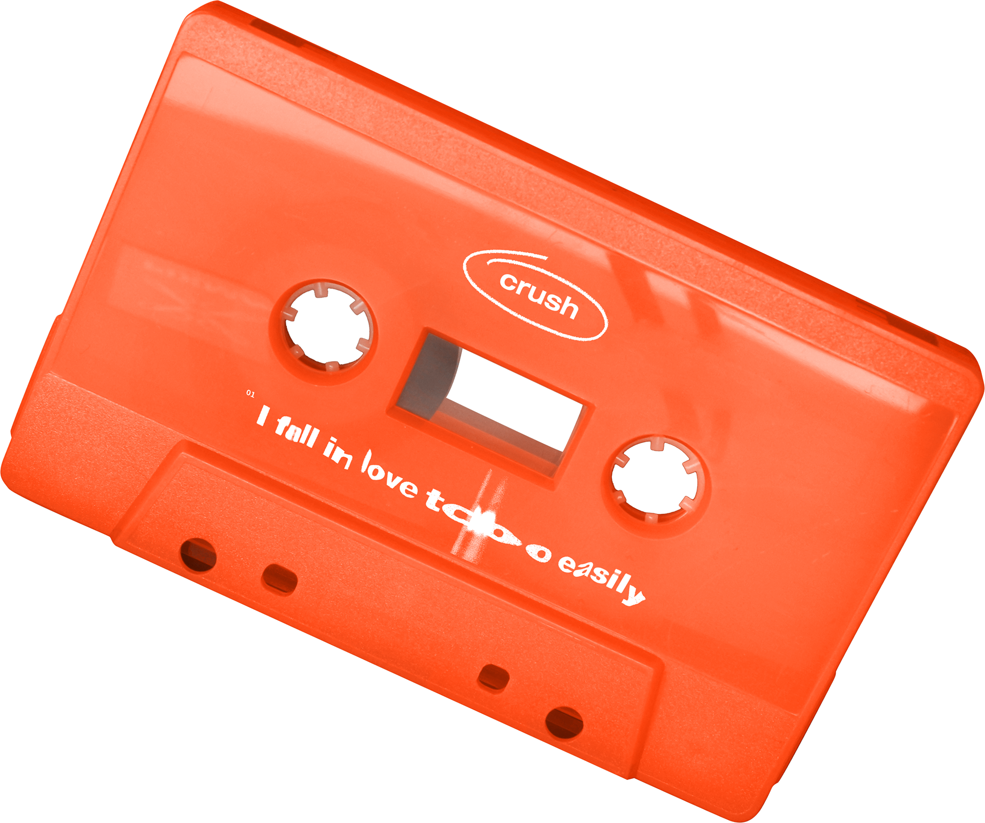

쉽게 빠진 사랑이 지나간 후에 남은 상처를 물과 뜨거운 열에 의해 망가진 카세트테이프로 표현하였습니다. 사랑에 쉽게 빠져 상처 받는 것을 카세트테이프가 물에 닿자마자 불의 색으로 변하는 것으로 표현했습니다. 또한 자전적인 느낌의 가사를 손글씨로 표현하여 일기를 쓰는 듯한 느낌을 담았습니다.
The wound left after the easily lost love passed by was expressed with cassette tape broken by water and hot heat. It describes falling in love easily and being hurt as a color of fire as soon as the cassette tape touches the water. In addition, the autobiographical lyrics are expressed in handwriting to express the feeling of writing a diary.